
How to Choose the Right Colors for a Calming Yet Energizing Pilates Studio
Choosing the right colors for a Pilates studio design is more than a design choice—it shapes how people feel and move in the space. Pilates is about balance, control, and fluid movement, and the color scheme should reflect that. The right palette can set the tone for an experience that is both soothing and uplifting, helping clients stay focused while feeling at ease.
This guide breaks down the best shades to use, how to mix them, and which ones to avoid, ensuring your Pilates studio creates the perfect atmosphere for both relaxation and motivation.
The Psychology of Colors in a Pilates Studio
Colors influence mood, concentration, and even energy levels. A Pilates studio needs to strike a balance—too much stimulation can be overwhelming, while a space that’s too muted may feel uninspiring.
- Cooler shades bring a sense of calm, making them perfect for deep breathing and controlled movements.
- Warm, muted tones create a welcoming environment without overstimulating the senses.
- Brighter accents add a subtle lift to the atmosphere, keeping the space engaging without being distracting.
A well-thought-out color scheme helps clients feel comfortable yet alert, allowing them to move with ease and focus.
Best Colors for a Calming Atmosphere
A Pilates session should feel like an escape from everyday stress. Choosing soft, natural hues can make the space feel open, peaceful, and inviting.
✔ Soft Blues – Shades of pale blue promote mental clarity and relaxation, helping clients transition into their workouts without tension. These shades work beautifully in studios with large windows and natural light.
✔ Muted Greens – Inspired by nature, greens evoke balance and renewal. Tones like sage, eucalyptus, and olive bring a subtle energy while keeping the space grounded.
✔ Warm Neutrals – Soft beiges, off-whites, and greige tones keep the space feeling open and airy. These colors work well for walls and large surfaces, allowing accent tones to shine without overpowering the room.
These shades work together to create an environment where clients feel calm yet engaged in their movements.
Best Colors for an Energizing and Focused Space
While calm tones are essential, a little boost of energy is just as important. Pilates is about focus, strength, and precision—colors that encourage these elements help keep the space dynamic.
✔ Earthy Yellows – Soft mustard or warm honey tones can add a gentle vibrance without being overpowering. These shades bring a sense of light and warmth, making the studio feel more inviting.
✔ Peach and Soft Coral – A touch of warmth without intensity. These colors subtly energize the space while keeping the overall mood relaxed.
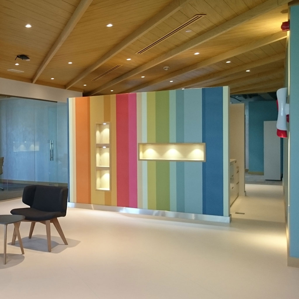
✔ Deep Teal or Dusty Rose – A great choice for an accent wall or small decorative elements. These hues balance sophistication with energy, making the space feel fresh yet refined.
A mix of these energizing tones, combined with calming neutrals, can bring the right balance of warmth and focus.
Colors to Avoid in a Pilates Studio
Not every color works well for a Pilates environment. Some shades can feel too intense, making the space feel chaotic rather than controlled.
🚫 Bright Reds & Intense Oranges – These shades increase heart rate and can feel overwhelming, especially in a space meant for mindful movement.
🚫 Dark or Heavy Colors – Deep browns, heavy purples, or pure black can make a space feel closed off, which isn’t ideal for a studio where movement and flow are essential.
🚫 Neon Shades – Too much brightness can lead to visual fatigue, making it harder for clients to focus.
By steering clear of overpowering colors, the studio can maintain a balanced, welcoming feel.
How to Mix Colors for the Perfect Balance
The key to a visually appealing Pilates studio is layering colors in a way that supports movement and relaxation.
✔ Main Walls: Stick to soft neutrals like off-white, greige, or warm beige. These shades provide a clean backdrop without overwhelming the senses.
✔ Accent Walls: A muted blue, sage green, or dusty peach can add personality while keeping the atmosphere serene.
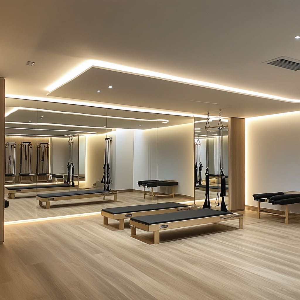
✔ Ceiling & Flooring: Lighter shades on the ceiling make the space feel open and airy, while natural wood or light-toned flooring helps create a sense of warmth and stability.
✔ Decor & Equipment: Yoga mats, resistance bands, and props in soft, earthy shades can tie the space together while avoiding clutter.
Creating contrast with subtle variations in tone makes the studio feel intentional and cohesive.
Incorporating Color Through Lighting & Decor
Even the best color palette needs good lighting and decor choices to shine.
💡 Soft LED Lighting – Avoid harsh, cool-toned fluorescent lights. Warm LEDs create a relaxing yet energizing glow, making the space more inviting.
🌿 Natural Elements – Plants bring in fresh energy and add a natural pop of color without overwhelming the space.
🪞 Mirrors & Reflective Surfaces – Not only do mirrors improve form and technique, but they also reflect light, making the space feel larger and brighter.
When these elements work together, they help create an atmosphere that enhances movement without distractions.
Final Thoughts
The right color scheme can completely change the atmosphere of a Pilates studio. A mix of soothing neutrals, subtle energy-boosting shades, and natural elements can make the space feel welcoming, inspiring, and perfectly balanced.
Before committing to a final palette, test different shades in natural and artificial light to see how they interact throughout the day. A Pilates studio should feel like a retreat—a space where clients can move with intention, free from distractions.
By choosing the right colors, you create an environment where people feel motivated, comfortable, and ready to move.